
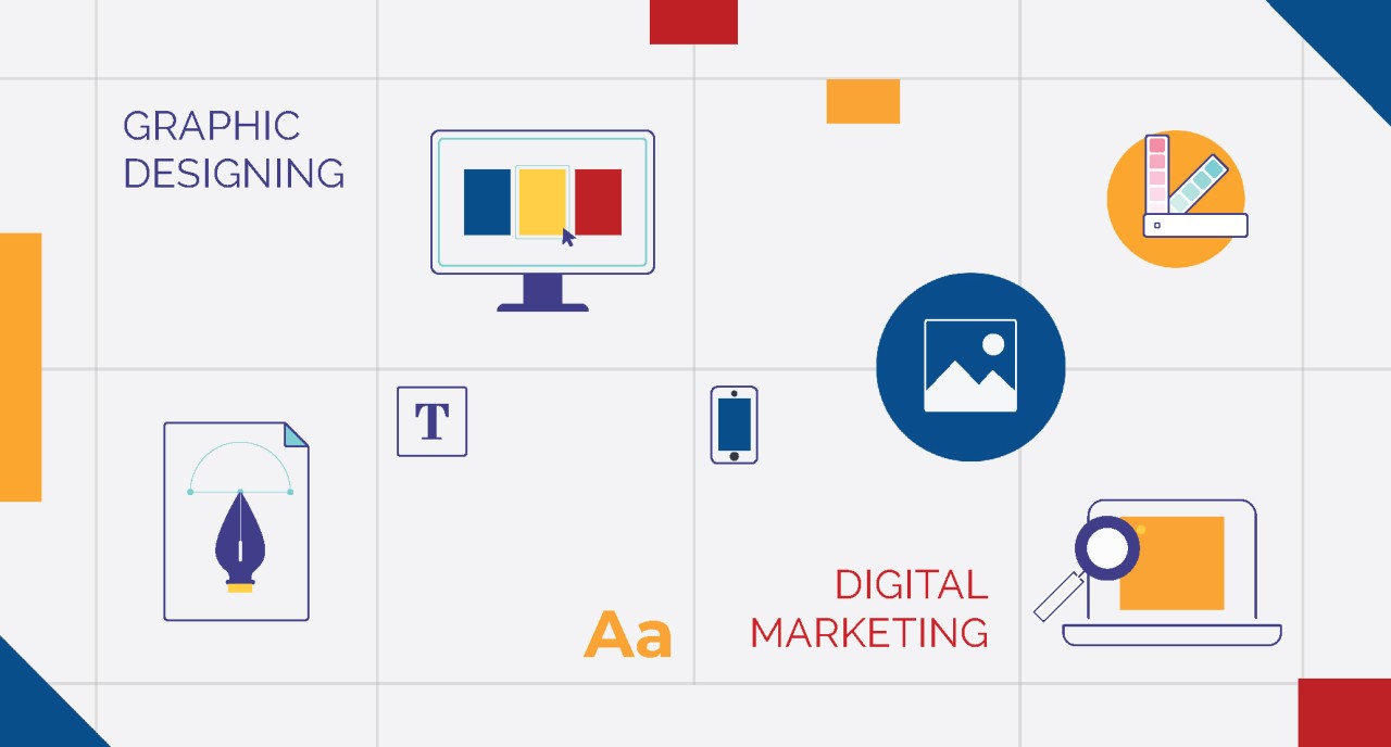
In this digital era, where attention spans of the viewers are shorter and information is overloaded, keeping a reader has been a constant challenge. Thus, the role of iconography in digital marketing has become increasingly important. Iconography, the art of developing and using icons, has proven itself as an effective tool for capturing audiences. It removes ambiguity from any concept and makes the data more presentable and easier to handle. No wonder, companies like Google, Facebook, Walmart, Samsung, and many others are investing billions of dollars annually in their unique iconographic image.
Why Iconography is Important
Iconography works as an identity to a company. Research in human behavior shows that when people think of a brand, the first things that come to their mind are those brand's standard icons. For example, when we think of Gmail, the red M in an envelope immediately pops into our heads. Same goes to the popular brand Apple when we instantly see the black apple icon with a bite in it. Icons are easily engraved in the brains of users and have a higher chance of being identified even when encountered randomly. Think of the little blue bird as the Twitter icon or the white "f" in a blue box as the Facebook icon. These icons have become synonymous with their respective brands which make them instantly recognizable.
Icons also serve as navigational tools that help users easily navigate through various pages on websites and applications. Instead of scrolling through a web page to find a desired section, users can simply click on the icon to directly reach their destination. Icons also ease other tasks such as printing, going back or forward on web pages, and skipping pages. Their easy-to-spot and convenient-to-access nature makes these tasks much easier and increases the overall user experience.
In a world full of text, icons provide perspective and draw viewer’s attention to your products, services, menus, or features. They save users from the hassle of combing through unnecessary words and let them find what they are looking for. Icons offer a compact image of information in an attractive and user-friendly manner. For example, imagine if the icons on your taskbar or smartphone were replaced with plain text. This will only make your user experience dull and less engaging. Icons not only make our tasks easier but also provide an aesthetically pleasing experience, thanks to the scientific design behind their colors, angles, edges, and figures. They not only assist users in various tasks but also subconsciously make them pleased, being visually more appealing.
Iconography has been an integral part of user-company interaction since the 18th century. It plays a pivotal role in marketing and advertising your products. These icons convey a big amount of information in a compact and visibly attractive way which communicates faster with the readers/viewers. From electronic devices to paper advertisements, icons are everywhere, grabbing users' attention and guiding them to your promotional contents.
Basics of Icons
Every day we come across various kinds of iconography that we may or may not categorize but simply absorb the data through them. But there is a basic point for Icons that every editor must stick to. Those are…
Clarity: Icons should clearly communicate a concept, avoid ambiguity and reduce cognitive load for users.
Readability: Avoid using excessive fine lines and decorative elements in icons, and ensure there is enough space between the icons and labels.
Alignment: Find the right balance and adjustment for your icons to create a sense of harmony within the design.
Brevity: Simplify icons by using fewer decorative details, lines, and a simpler concept to convey your intended message effectively.
Consistency: Apply the same style, including visual weight, stroke thickness, size, corner radius, shape, and fill, throughout all icons to maintain a cohesive and unified design.
Personality: Consider the mood and personality you want to convey with your icon design. It will ensure that it aligns with the product's brand identity.
Ease of use: Ensure that the icon set is well-organized and easy to use for other designers and developers. Document the icon set and conduct testing before implementation.
Iconography Strategy
In a branding process, creating guidelines for iconography and illustrations is more important than it seems. These guidelines ensure consistency and coherence across all of your marketing efforts. Icons and illustrations serve as powerful visual elements that can convey big ideas without relying solely on text. Icons can captivate and engage readers when you use it effectively, it makes marketing messages more memorable.
To use icons successfully, it is important to strategize their implementation. Icons can be used to signify key points, breaking up text-heavy content and making it more digestible for readers. They can also be used to label charts or graphs, adding visual elements to data and making it more engaging. Icons are valuable in guiding users through processes or steps, providing intuitive visual cues for actions. They can also be used as visual accents by adding visual interest and enhancing the overall design aesthetic. Icons can also be utilized to represent brand values and identity which create a sustainable and recognizable visual language for the brand.
Factors to Implement Correctly
When building an icon system for your promotional contents, there are several factors to consider before. Without sticking to these fundamentals, you cannot ensure your iconography will reach your consumers.
Size:
Choose a compatible size for your icons, such as 24x24px or 32x32px, to maintain scalability and ease of implementation.
Strokes and fills:
Decide whether you want to use stroked or filled icons. Stroked icons have outlines with a routinely weight, but filled icons consist of solid shapes with negative space.
Color:
Build the icon design system using one color, such as black. It allows flexibility in blending the icon color to suit different designs.
Grids:
Utilize a pixel grid to keep icons aligned and spaced. Check for optical balance, ensure icons' center of mass and level of detail which occupy appropriate visual space.
Design process:
Before diving into drawing icons, create a list of all the icons you plan to design. Start with simpler icons to guide your style choices and facilitate decision-making.
Iconography assigns identity to your brand, facilitates your site reach, provides perspective in a text-heavy world, and enhances the overall user experience making it more friendly. In today’s world, they have become more compatible with brands that makes them instantly recognizable and memorable by the consumers. As digital marketing continues to evolve, the use of iconography will remain a fundamental tool for engaging and capturing audiences in a visually-driven sphere.


